On Demand Workouts
Roles: Product Designer / Project Lead
Tasks: UX Research, info architecture & Visual Design
Platforms: Android & iOS
Year: 2021
Background
Training desire fluctuates daily. After several research and data inputs we noticed that our paying users would struggle with their routine. Long term motivation is hard to build and there are several reasons why someone would drop their training. During user interviews there were top 3 "wishes" for those struggling.
- "I want to train in a group, or with someone"
- "I want to try something new once in a while"
- "I want to focus on a part of my body today "
With that in mind, we framed our problem. How might we support struggling athletes with their training, so that they can stay motivated during longer periods of time?
Kick off
To get as many ideas as possible we did a brainstorming session with a cross functional team that included engineers, training experts, user researchers, designers, and product managers.
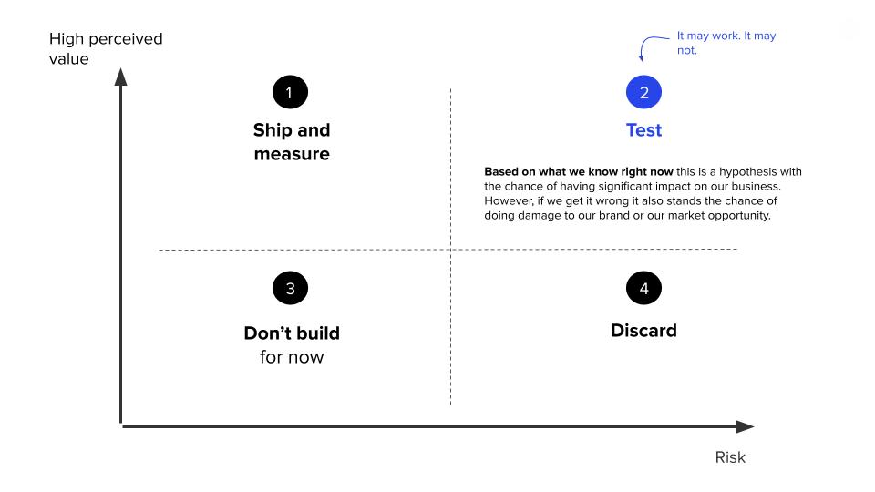
Most of the ideas pointed out one specific area of the app. The Explore section seemed to be the place where we could test our different ideas. However, this part of the product was quite old and not flexible. For that reason, we decided that we could combine our user HMW with a business goal. Invest in agility, optionality, and ability to capture short-term trends by building a new explore section from scratch, allowing us to also measure the impact for each idea separately.
Freeletics ambassador’s input
User research
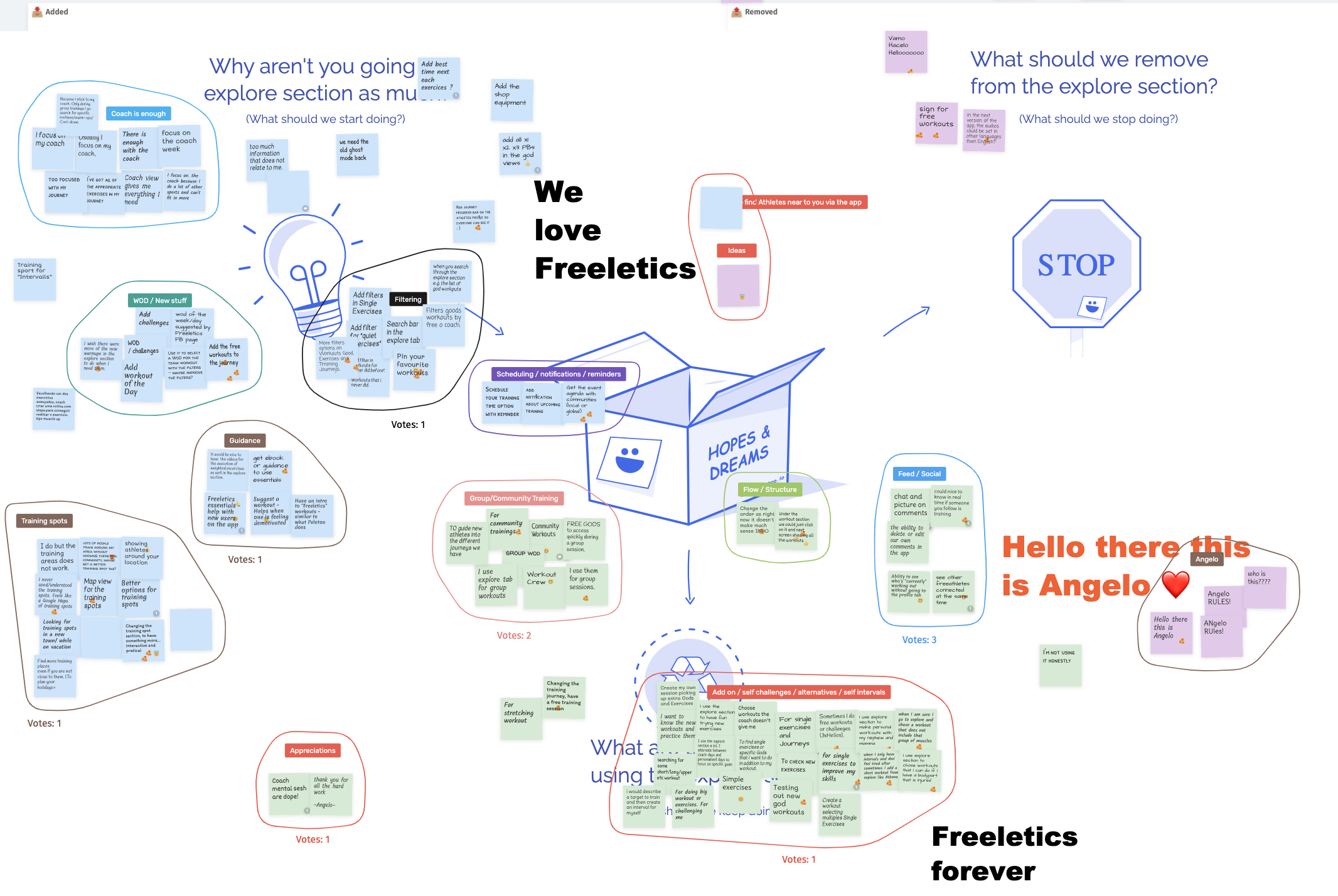
For this project user research was key. On-demand workouts is different from the explore section, however, to know what was working already and what might need to be improved we organized a session with our ambassadors around the world to understand which elements of this section was worth keeping when doing the section refresh.
For this we had a call with ~40 participants. We timed the session to an hour. They had to post as many comments as possible or ideas they had around the following questions.
- Why aren't you going to the section as much?
- What should we remove?
- What are the reasons you are using this section?
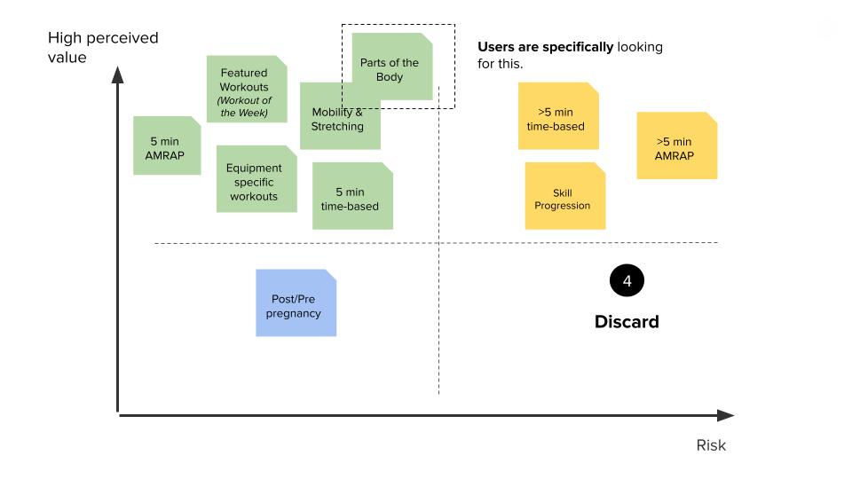
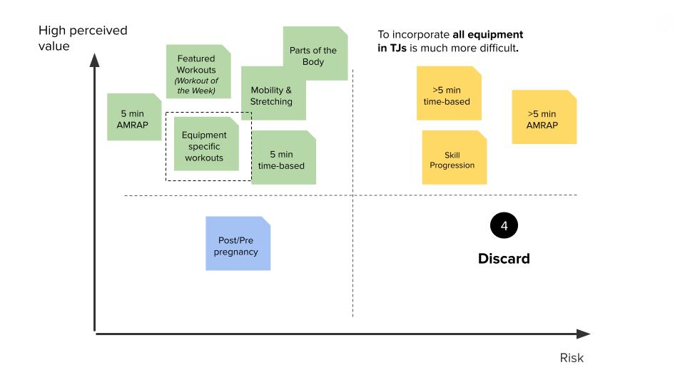
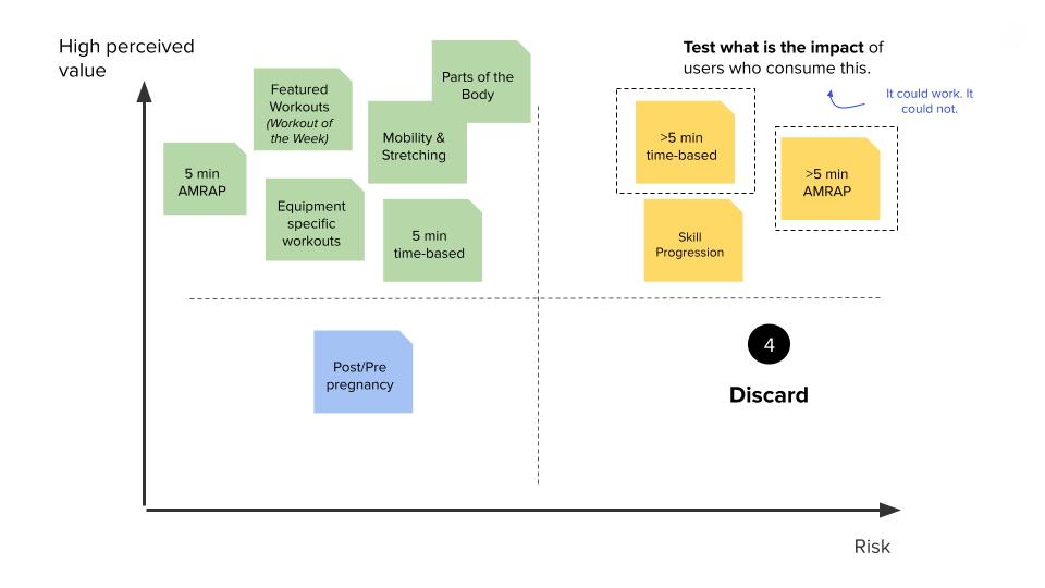
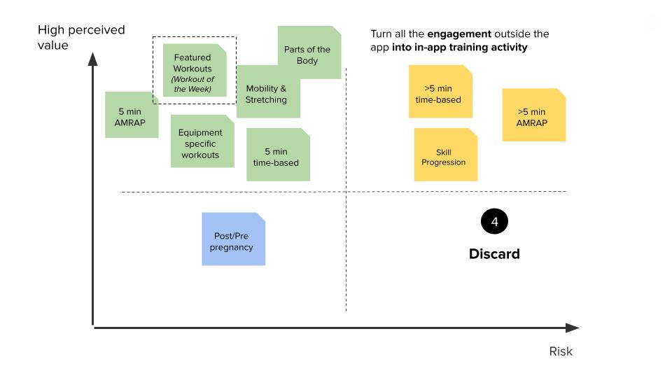
After some clustering, we were able to spot the categories. Finding the "best" way to organize the structure was complex. To understand further how people would group information we set up a couple of sorting cards exercises with experienced and non-experienced athletes. The outcome showed us two things.
- - Having different entry points for the same workout was a need. i.e., Body part vs equipment.
- - There was no preferred way to look for a workout. These would vary on a daily context; I have no time vs I want to focus on a body part or muscle group.
From these insights we recognized there was not gonna be a "one way" to fit everyones priorities. The best way was to build something flexible enough to allow us change positions of the content and change it quickly if needed.
Info architecture research
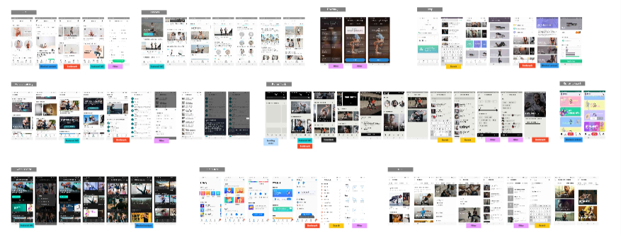
Sample of our desk research
For the visual update, we checked on different apps and products that had similar concepts (CMS - Content management system) like streaming apps, cooking apps and other fitness apps. This with the goal of finding common UI patterns that we could get inspired by.
Design process
Starting with wireframes helped us drive the conversation early on with developers. Defining the elements and the layers of each content was crucial for efficiency and scope.
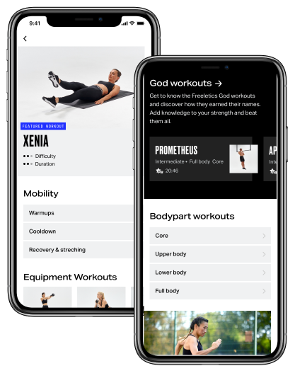
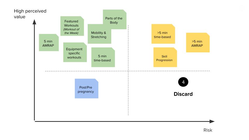
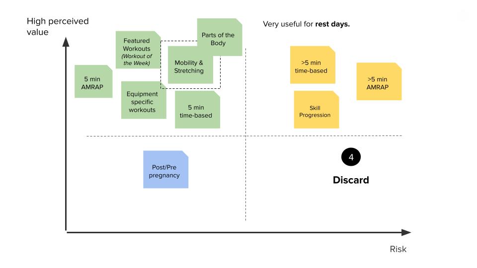
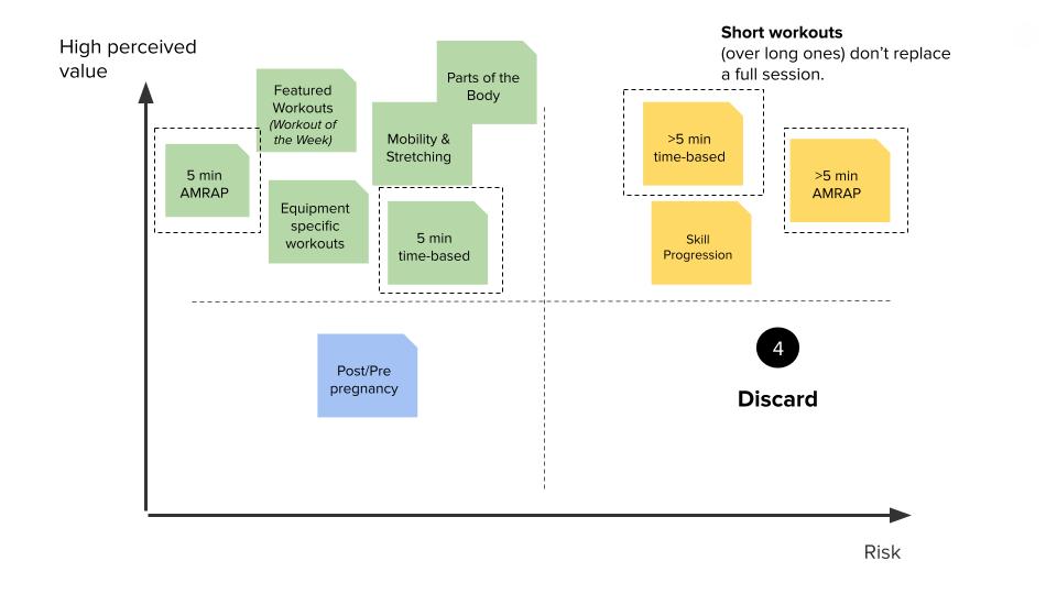
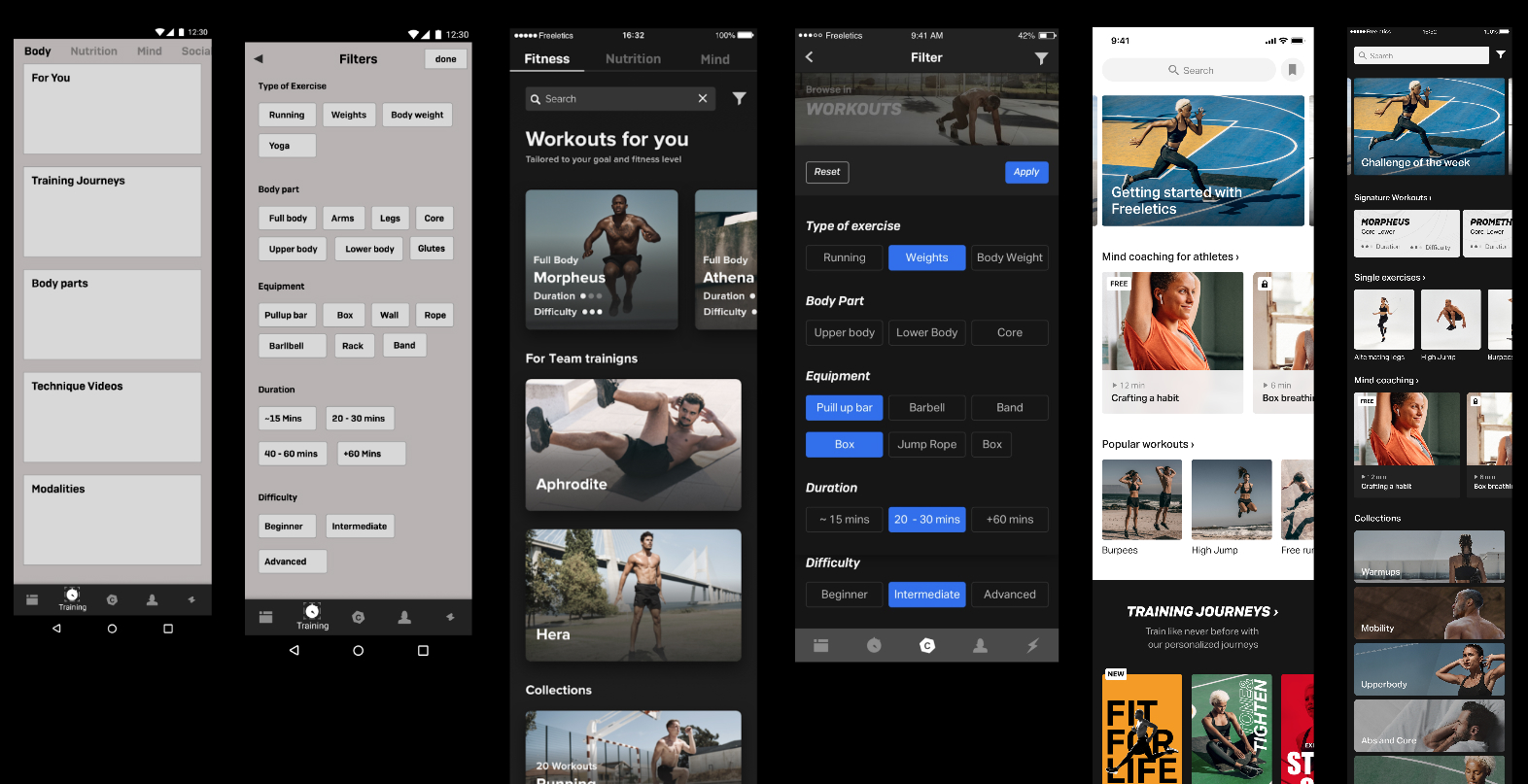
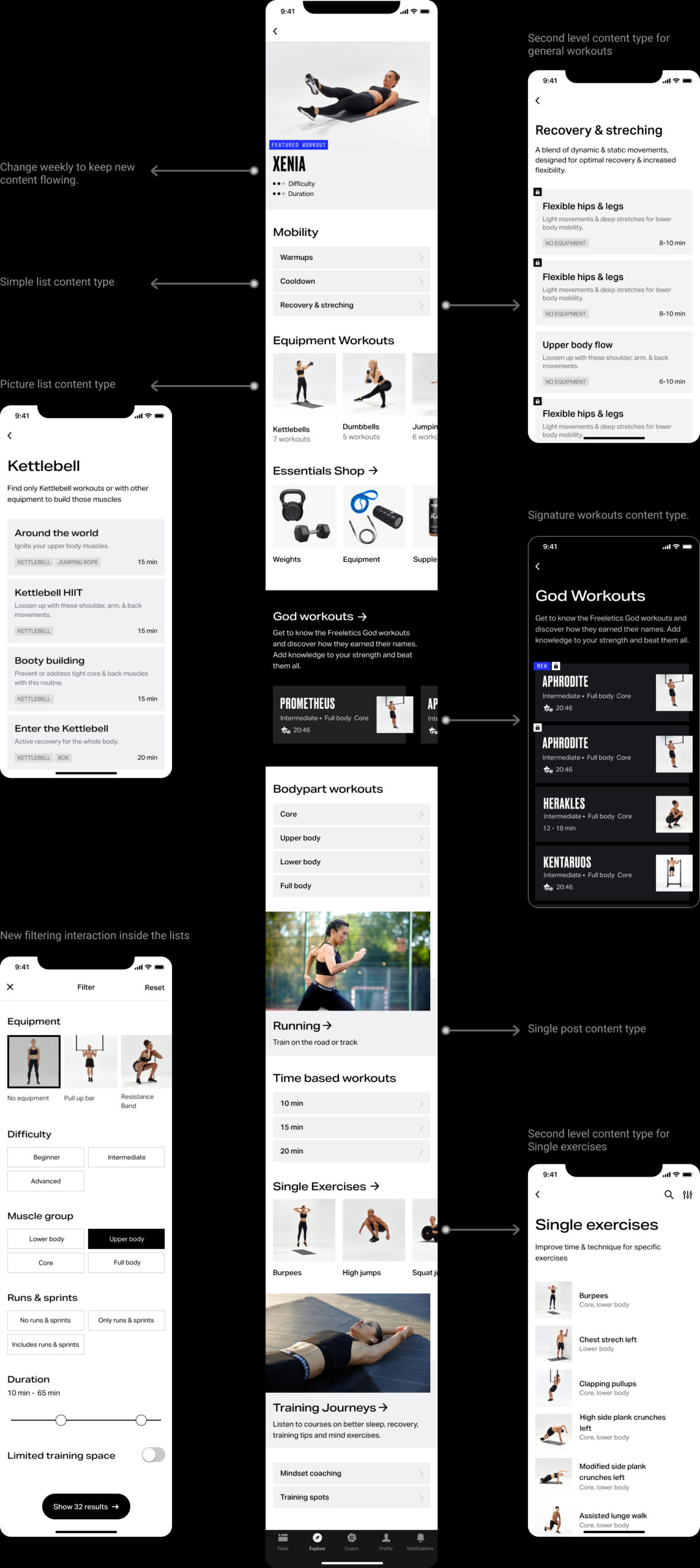
The design was thought of as a block system where the content can be organized differently for testing purposes. We defined 5 content types for the first level of information and 3 for the second level.
Filtering and search were also improved. Users can now filter in a more detailed way and find workouts that fit better to their needs.
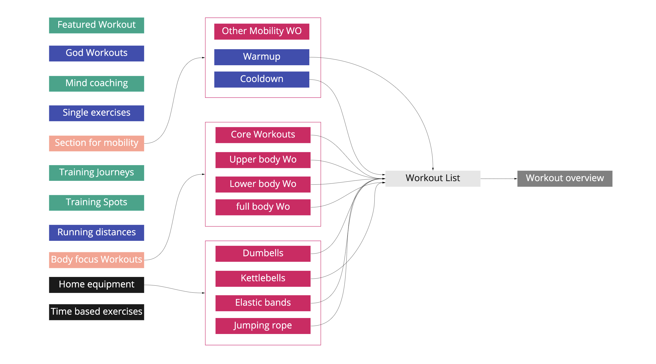
First ideas about the content arquitectue
Iteration process
Final design
Impact
42% Increase of Weekly Active Paying Users training on-demand. An overall increased retention for active users.We can now test and launch partnerships faster, new types of workouts and test seasonal experiences/challenges. Integration of Freeletics Essentials (Shop) to our App, increasing 10% on revenue
Learnings
Having a clear understanding on who will have ownership after the project is completed in order to plan and change the content is key. We unfortunatelly didn't have enough resources to update the section as much as we though we would. This created a static feeling and engagement lowered for old users.
During the implementation face of this project, we lost our Product owner. This pushed us a team to work more syncronous and make sure that we communicated proactively to the company about the roap map and our releases.
Fun fact: It was the first completed project on schedule for that crew, team work pays off.
User impact
Business impact
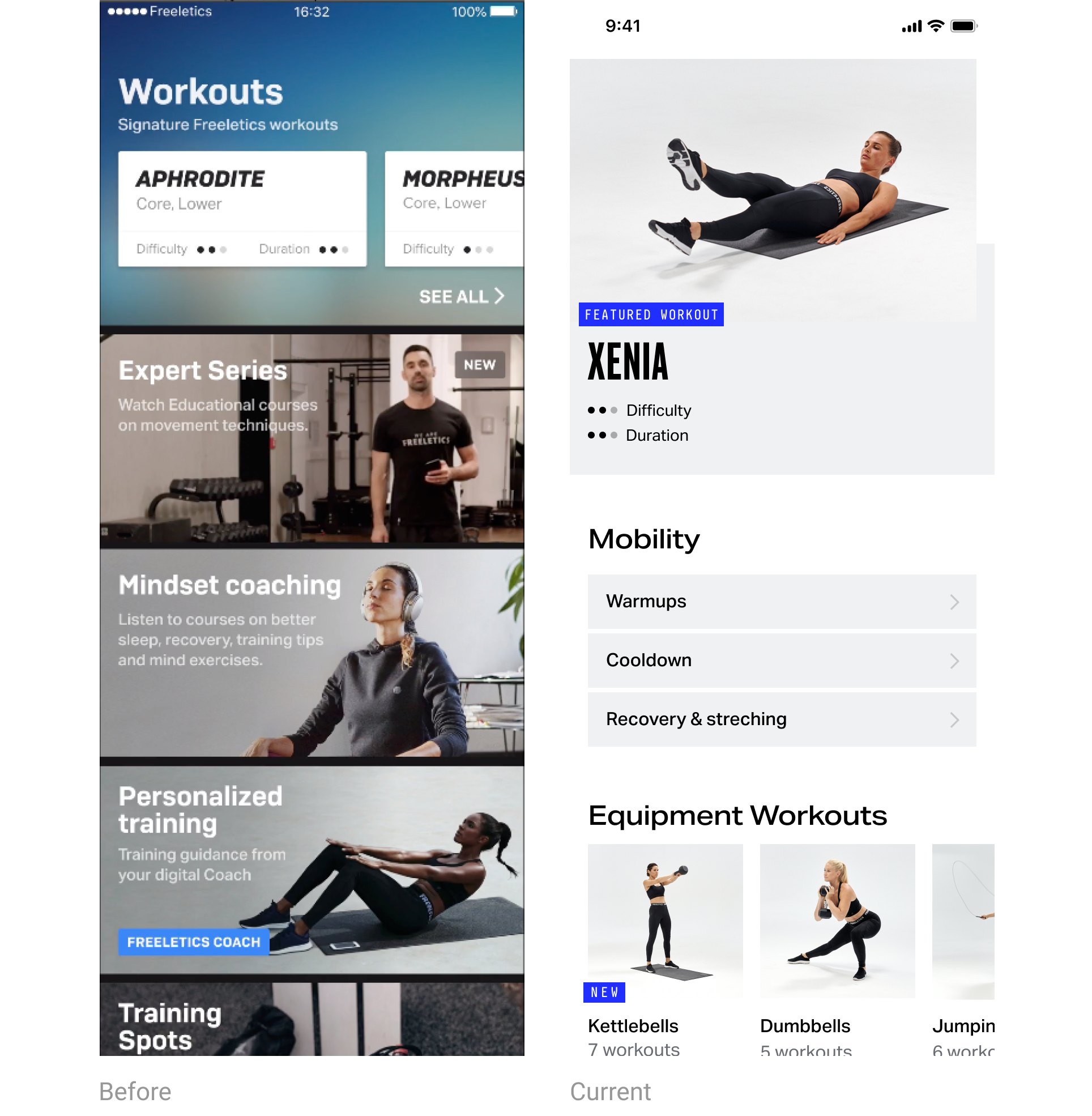
Old training flow vs new training flow