Propstack
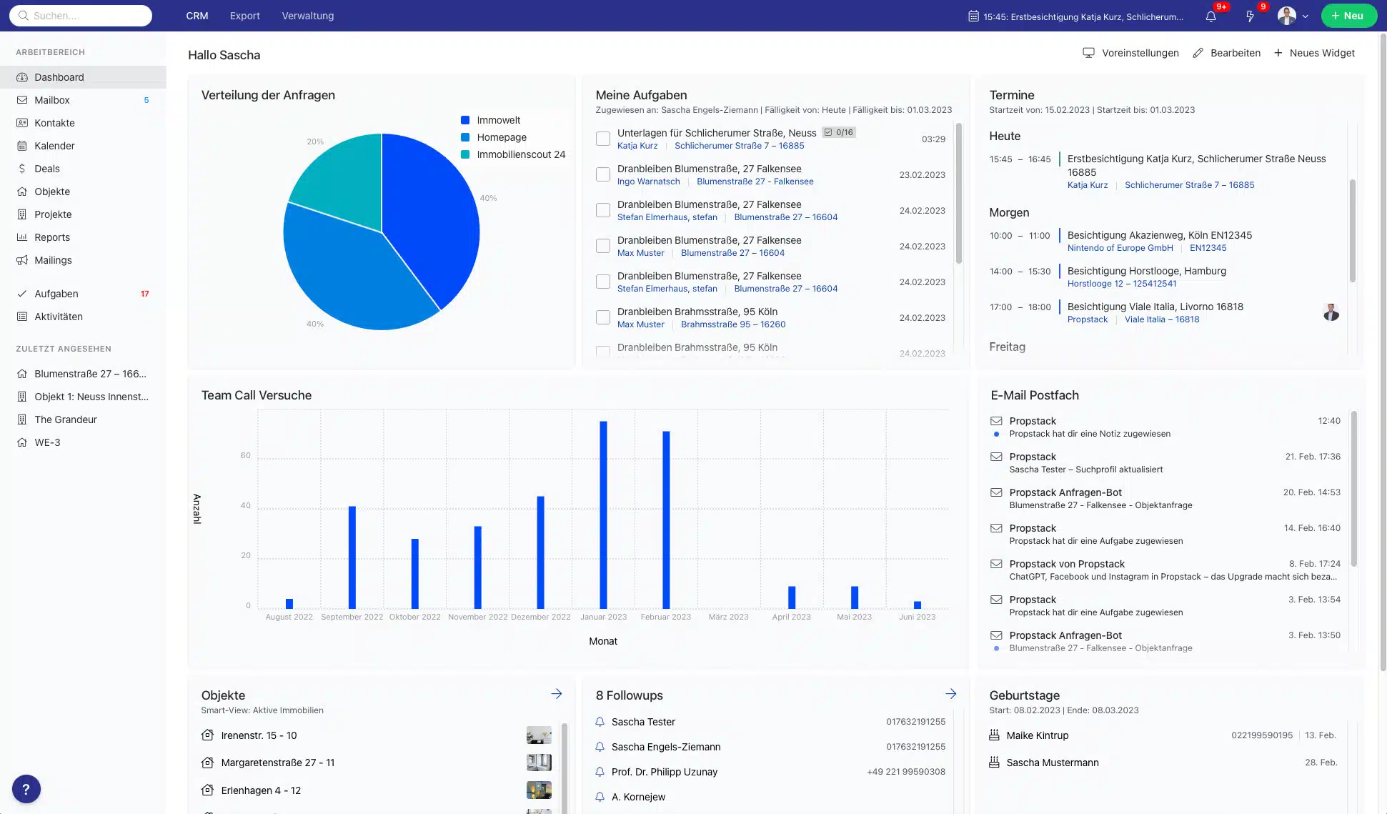
Crafting a CRM Design System for seamless scalability across devices. Engineered for simplicity and ease of integration, from the smallest components to the most intricate interfaces.
Roles: Senior Product Designer / Design Ops
Tasks: Design system and UX design
Platforms: Android, iOS & Desktop

Figure 1: Health App website (Apple 2021)
WHERE WE ARE
Current Milestones
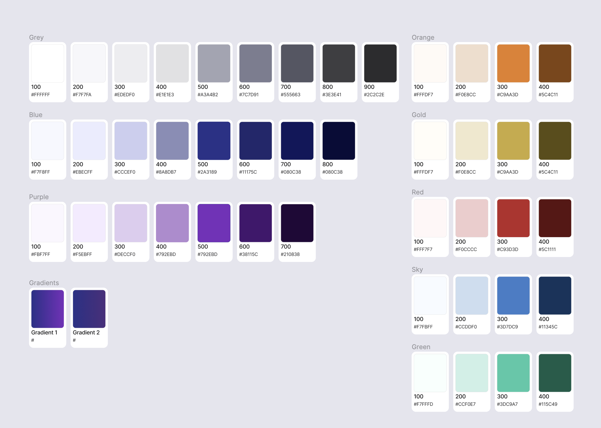
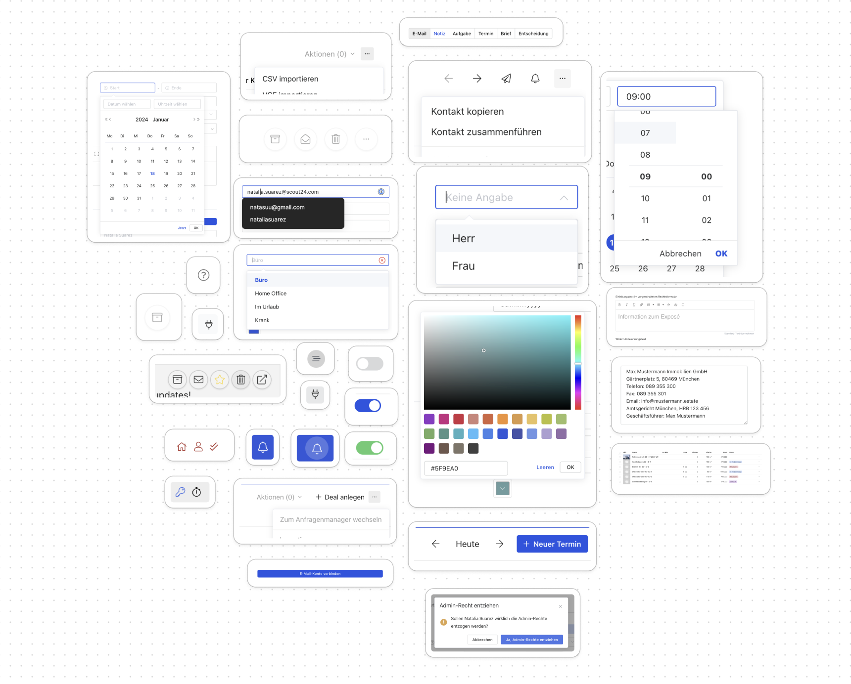
We've successfully established key elements of Propstack's design system. Our adaptable color palette is optimized for both light and dark modes, enhancing user experience. Additionally, we've defined essential typography and basic UI components, including buttons and form inputs, ensuring consistency and ease of use.


WHERE WE BEGAN
UI Inventory and UX Audit
We began by fixing inconsistencies in animations, colors, components, and typography and conducted a Heuristic Audit to pinpoint urgent UX improvements. After addressing these, we streamlined colors and fonts in our Figma library.
To enhance efficiency, we adopted Font Awesome for our iconography, speeding up implementation and maintaining quality with our limited resources.
WHAT IS NEXT?
Mobile implementation
We're now starting to implement the foundational components and core elements of our design system into our mobile app. This approach accelerates our testing process, capitalizes on our team's capacity, and minimizes risks. Since most of our users are on desktops, beginning with mobile allows us to test and refine efficiently, setting a solid foundation for broader application.
.